# Color Palette
The Color Palette field allows you to display a set of color palettes that a theme or plugin might use throughout, giving your users a choice of UI colors.
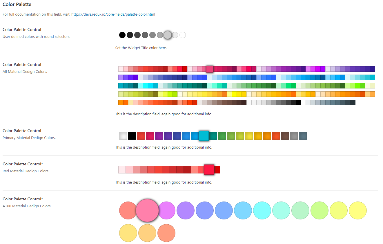
Table of Contents
# Arguments
| Name | Type | Default | Description |
|---|---|---|---|
| type | string | color_palette | Value identifying the field type. |
| default | string | Default color selection to display on the palette. | |
| options | array | Array of attributes to set the palette styles and colors. See Option Defaults. |
Also See
# Option Defaults
| Name | Type | Default | Description |
|---|---|---|---|
| colors | array | Array of colors to display in the palette. Define your own color array or use one of the included presets. See Color Palette Presets below. | |
| size | int | 20 | Sets the width of the palette. |
| style | string | 'square' | Sets the style of the palette items. Accepts: square or round. |
| box-shadow | bool | false | Flag to draw an inset box shadow in the individual palette color blocks. |
| margin | bool | false | Flag to draw margins between the palette color blocks. |
# Color Palette Presets
Redux includes a helper function that returns a preset array of colors for use in your projects.
Pass the following function to the colors argument:
Redux_Helpers::get_material_design_colors( 'primary' );
The function accepts the following values: primary, red, pink, purple, deep-purple, indigo, blue, light-blue, cyan, teal, green, light-green, lime, yellow, amber, orange, deep-orange, brown, gray, blue-gray, 50, 100, 200, 300, 400, 500, 600, 700, 800, 900, A100, A200, A400, A700
# Example Config
Redux::set_section(
	$opt_name,
	array(
		'title'      => esc_html__( 'Color Palette', 'your-textdomain-here' ),
		'desc'       => esc_html__( 'For full documentation on this field, visit: ', 'your-textdomain-here' ) . '<a href="https://devs.redux.io/core-fields/color-palette.html" target="_blank">https://devs.redux.io/core-fields/palette-color.html</a>',
		'id'         => 'color-palette',
		'subsection' => true,
		'fields'     => array(
			array(
				'id'       => 'opt-color-palette-grey',
				'type'     => 'color_palette',
				'title'    => esc_html__( 'Color Palette Control', 'your-textdomain-here' ),
				'subtitle' => esc_html__( 'User defined colors with round selectors.', 'your-textdomain-here' ),
				'desc'     => esc_html__( 'Set the Widget Title color here.', 'your-textdomain-here' ),
				'default'  => '#888888',
				'options'  => array(
					'colors' => array(
						'#000000',
						'#222222',
						'#444444',
						'#666666',
						'#888888',
						'#aaaaaa',
						'#cccccc',
						'#eeeeee',
						'#ffffff',
					),
					'style'  => 'round',
				),
				'output'   => array(
					'color'     => '.widget-title',
					'important' => true,
				),
			),
			array(
				'id'       => 'opt-color-palette-mui-all',
				'type'     => 'color_palette',
				'title'    => esc_html__( 'Color Palette Control', 'your-textdomain-here' ),
				'subtitle' => esc_html__( 'All Material Design Colors.', 'your-textdomain-here' ),
				'desc'     => esc_html__( 'This is the description field, again good for additional info.', 'your-textdomain-here' ),
				'default'  => '#F44336',
				'options'  => array(
					'colors' => Redux_Helpers::get_material_design_colors( 'all' ),
					'size'   => 17,
				),
			),
        )
	)
);
# Example Usage
This example is based on the example usage provided above. Be sure to change $redux_demo to the value you specified
in your opt_name argument.
global $redux_demo;

echo esc_html__( 'Selected color: ', 'your-textdomain-here' ) . $redux_demo['opt-color-palette-grey'];