# Box Shadow
The Box Shadow control allows for the addition of a box shadow to be drawn around any specified element.
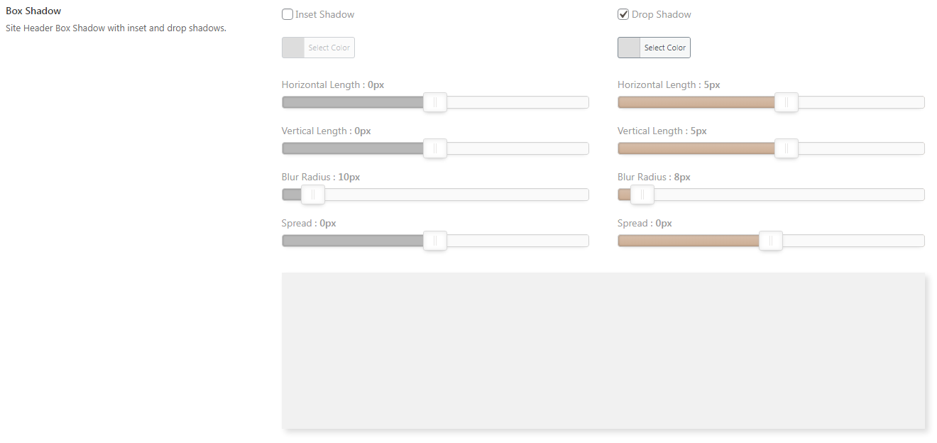
Table of Contents
# Arguments
| Name | Type | Default | Description |
|---|---|---|---|
| type | string | box_shadow | Value identifying the field type. |
| default | string | See Default Argument below. | |
| preview_color | string | #f1f1f1 | Sets the color of the preview object. |
| inset-shadow | bool | true | Flag to display the inset-shadow option (checkboox). |
| drop-shadow | bool | true | Flag to display the drop-shadow option (checkboox). |
Also See
# Default Arguments
| Name | Type | Default | Description |
|---|---|---|---|
| inset-shadow | array | Array of display attributes for the inset shadow. See Shadow Defaults below. | |
| drop-shadow | array | Array of display attributes for the drop shadow. See Shadow Defaults below. |
# Shadow Defaults
| Name | Value | Default | Description |
|---|---|---|---|
| checked | bool | false | Sets the checkbox to enable the specified section. |
| color | string | false | Sets the checkbox to enable the specified section. |
| horizontal | int | inset:0drop: 5 | Sets horizontal value of the specified section. |
| vertical | int | inset:0drop: 5 | Sets vertical value of the specified section. |
| blur | int | inset:10drop: 5 | Sets blur value of the specified section. |
| spread | int | inset:0drop: 1 | Sets spread value of the specified section. |
::: Outputting the CSS
To automatically output the CSS for the box shadow, include the class name of the element to which the filters should be applied via the output argument.
:::
# Example Config
Redux::set_field(
    'OPT_NAME',
    'SECTION_ID',
    array(
        'id'       => 'opt-color-box-shadow',
        'type'     => 'box_shadow',
        'output'   => array( '.site-header' ),
        'title'       => esc_html__( 'Box Shadow', 'your-textdomain-here' ),
        'subtitle'    => esc_html__( 'Site Header Box Shadow with inset and drop shadows.', 'your-textdomain-here' ),
        'desc'        => esc_html__( 'This is the description field, again good for additional info.', 'your-textdomain-here' ),
    )
);
← Border Button Set →