# Accordion field
The Accordion extension is an improved way to group like items in your options panel inside a collapsible accordion field. Such a feature comes in handy when a given options panel has many items that don't need to be shown simultaneously.
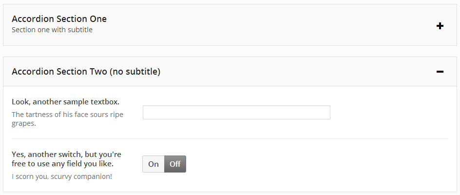
Table of Contents
# Arguments
| Name | Type | Default | Description |
|---|---|---|---|
| type | string | accordion | Value identifying the field type. |
| id | string | Unique ID identifying the field. Must be different from all other field IDs. | |
| title | string | Displays title of the field. | |
| subtitle | string | Subtitle display of the field, situated beneath the title. | |
| class | string | Appends any number of classes to the field's class attribute. | |
| position | string | Either start or end, depending on whether the array begins or ends the accordion block. See Example Config below. | |
| open | boolean | false | If set to true, accordion will be open. If set to false, accordion will be closed by default. |
| open-icon | string | el-plus | The Elusive Icon to show when the accordion is closed (to be opened). At this time, only Elusive Icons are supported. |
| close-icon | string | el-minus | The Elusive Icon to show when the accordion is open (to be closed). At this time, only Elusive Icons are supported. |
Also See
# Example Config
The following example is included with Redux's sample-config.php (opens new window) file.
NOTE
Each Accordion block MUST have an opening array with the position argument set to start, AND a closing array with the position argument set to end. Any fields you wish to display inside the accordion block would be added between the start and end arrays.
Redux::set_section(
    'OPT_NAME',
    array(
        'title' => esc_html__('Accordion Field', 'your-textdomain-here' ),
        'icon' => 'el-icon-thumbs-up',
        'fields' => array(
            array(
                'id'        => 'opt-accordion-begin-1',
                'type'      => 'accordion',
                'title'     => 'Accordion Section One',
                'subtitle'  => 'Section one with subtitle',
                'position'  => 'start',
                ),
            array(
                'id'       => 'opt-blank-text-1',
                'type'     => 'text',
                'title'    => 'Textbox for some noble purpose.',
                'subtitle' => 'Frailty, thy name is woman!'
            ),
            array(
                'id'       => 'opt-blank-text-2',
                'type'     => 'switch',
                'title'    => 'Switch, for some other important task!',
                'subtitle' => 'Physician, heal thyself!'
            ),
            array(
                'id'        => 'opt-accordion-end-1',
                'type'      => 'accordion',
                'position'  => 'end'
            ),

            // Second Accordion
            array(
                'id'       => 'opt-accordion-begin-2',
                'type'     => 'accordion',
                'title'    => 'Accordion Section Two (no subtitle)',
                'position'  => 'start',
            ),
            array(
                'id'       => 'opt-blank-text-3',
                'type'     => 'text',
                'title'    => 'Look, another sample textbox.',
                'subtitle' => 'The tartness of his face sours ripe grapes.'
            ),
            array(
                'id'       => 'opt-blank-text-4',
                'type'     => 'switch',
                'title'    => 'Yes, another switch, but you\'re free to use any field you like.',
                'subtitle' => 'I scorn you, scurvy companion!'
            ),
            array(
                'id'        => 'opt-accordion-end-2',
                'type'      => 'accordion',
                'position'  => 'end'
            ),
        ),
    )
);
The Accordion field has no return values for use on the front end. It's simply a tool to easier block and manage multiple options, providing your user with a cleaner and more appealing visual experience.