# Color Gradient
The Color Gradient control allows for the selection of two separate colors, for use in any situation that requires gradient colors (i.e. Header, footer, sidebar, etc...).
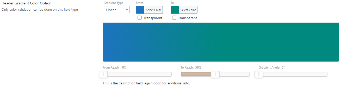
Table of Contents
# Arguments
| Name | Type | Default | Description |
|---|---|---|---|
| type | string | color_gradient | Value identifying the field type. |
| default | string | See Default Argument below. | |
| validate | string | The only accepted validation type is color. | |
| transparent | bool | true | Flag to set the visibility of the transparency checkbox. |
| preview | bool | false | Flag to displays the color preview. |
| preview_height | string | 150px | Sets the height of the color preview box. |
| color_alpha | bool | false | Flag to enable the alpha option for the color picker. |
| gradient-type | bool | false | Flag to set the gradient type slider. |
| gradient-reach | bool | false | Flag to set the gradient reach slider. |
| gradient-angle | bool | false | Flag to set the gradient angle slider. |
Also See
# Default Argument
| Name | Type | Default | Description |
|---|---|---|---|
| to | string | Hex string value for the left gradient color. | |
| from | string | Hex string value for the right gradient color. | |
| gradient-type | string | 'linear' | Sets the default gradient type. Accepts: linear or radial. |
| gradient-angle | int | 0 | Sets the default angle for the gradient. |
| grdient-reach | array | 'from' => 0'to' => 100 | Sets the from and to values that determines the reach of the gradient. Accepts in values between 0 and 100. |
Transparency
To set the transparency checkbox by default, use the string transparent in place of a string hex value in either the to or from argument.
Gradient Filters
To automatically output the gradient filters (type, angle, reach) as CSS, include the class name of the element to which the filters should be applied
via the output argument.
# Build Config
Build a Custom Configuration →
Changes you make to this form will be reflected in the generated code.
Redux::set_field( 'OPT_NAME', 'SECTION_ID', array(
    'type' => 'color_gradient'
) );
# Example Config
Redux::set_field(
    'OPT_NAME',
    'SECTION_ID',
    array(
        'id'       => 'opt-color-gradient',
        'type'     => 'color_gradient',
        'title'    => esc_html__('Header Gradient Color Option', 'your-textdomain-here'),
        'subtitle' => esc_html__('Only color validation can be done on this field type', 'your-textdomain-here'),
        'desc'     => esc_html__('This is the description field, again good for additional info.', 'your-textdomain-here'),
        'validate' => 'color',
        'output'         => '.site-header',
        'gradient-type'  => true,
        'gradient-reach' => true,
        'gradient-angle' => true,
        'default'        => array(
            'from'           => '#1e73be',
            'to'             => '#00897e',
            'gradient-reach' => array(
                'to'   => 50,
                'from' => 0,
            ),
        ),
    )
);
# Example Usage
This example in based on the example usage provided above. Be sure to change $redux_demo to the value you specified in your opt_name argument.
global $redux_demo;

echo 'From color: ' . $redux_demo['opt-color-gradient']['from'];
echo 'To color: '   . $redux_demo['opt-color-gradient']['to'];